
React (ReactJS) a library which do not need any introduction today for anyone who is working in the frontend space. It is famous not just because it is react. It is also widely known for it’s Component libraries. What are those? Simply put, a component library have implemented the respective CSS framework practices as react components which are ready to use which makes our development easier. Ask me, and I would say these libraries brings a great boost in your productivity by making your designs better and smoother. In today’s article, I will give you my top 5 React component libraries which I collected from the web, to implement in my future projects.
5. Headless UI Link to heading
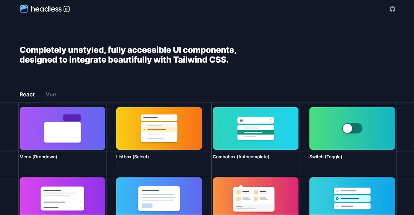
Headless UI is a set of completely unstyled, fully accessible UI components, designed to integrate beautifully with Tailwind CSS that makes it easy to build custom components without worrying about any of the complex implementation details yourself, and without sacrificing the ability to style them from scratch with simple utility classes. Therefore, if you have worked with Tailwind CSS and liked working with it’s extensive API to style your web-apps, Headless UI can make it even easier for you to implement component-based styling in your app.
4. Mantine UI Link to heading
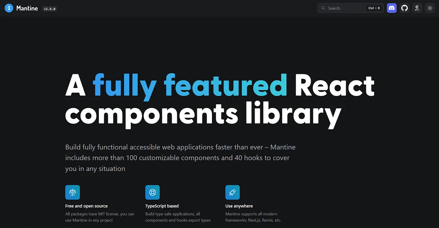
I personally liked it’s UI better than any other mentioned in this article, but haven’t worked with it that much so putting it on 4. Mantine is a component library for react with 💯+ components. It is built on TypeScript, features light/dark mode and has an extensive documentation on how to use it’s component library. With it’s attractive, elegant design Mantine also features it’s API to be fully-responsive for different screen sizes.
3. Chakra UI Link to heading
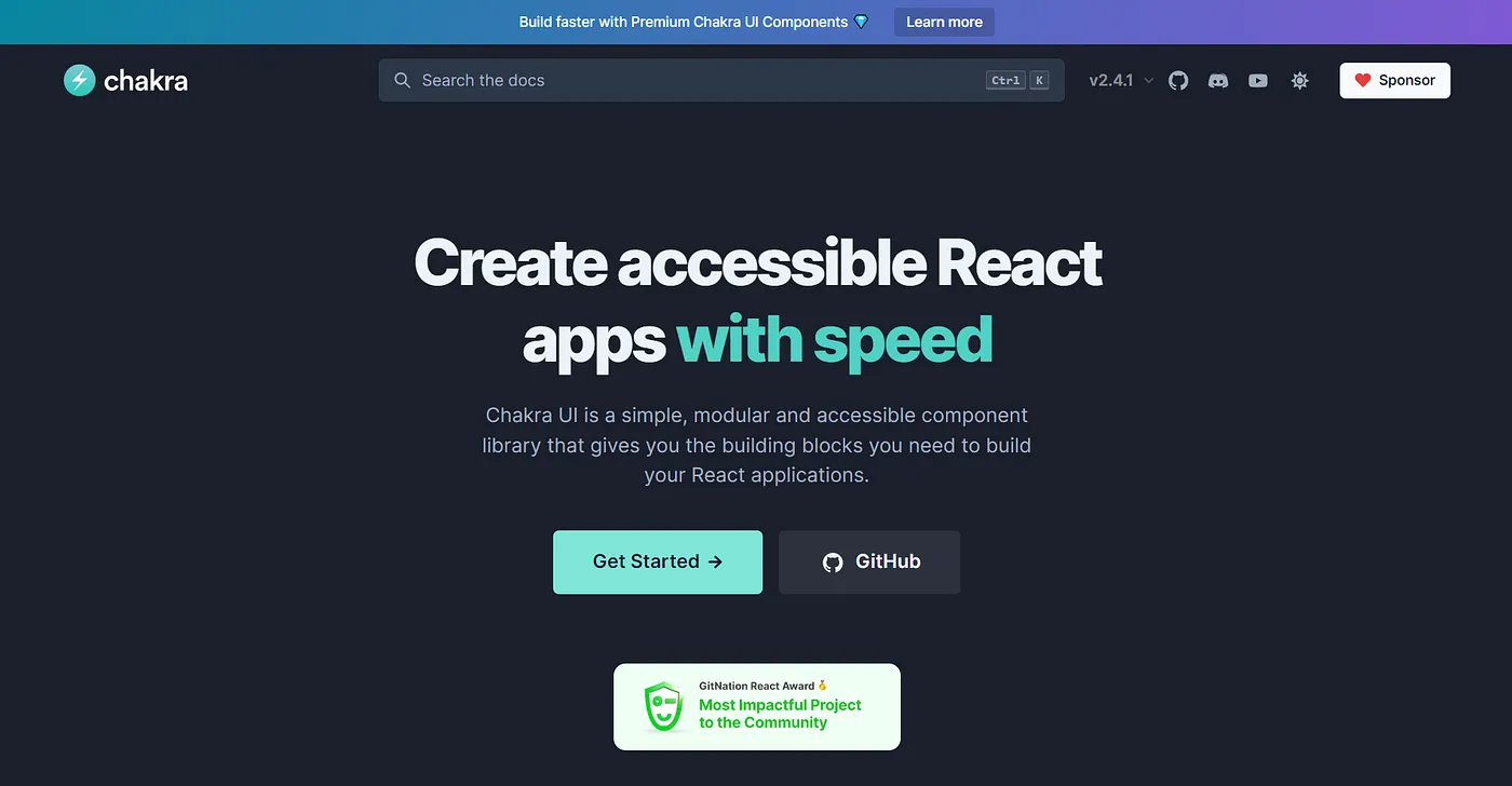
With the recent gain in it’s popularity ☀ Chakra UI is based on enhanced performance while rendering components when working with React, making your application to render elements faster. The theme offered by Chakra UI is said to be highly customizable, has an extensive support to build your own components (if needed), in-built optimization for light/dark modes. One thing I love about Chakra is it has a flourishing active community for developers to indulge in and learn together.
2. Fluent UI Link to heading
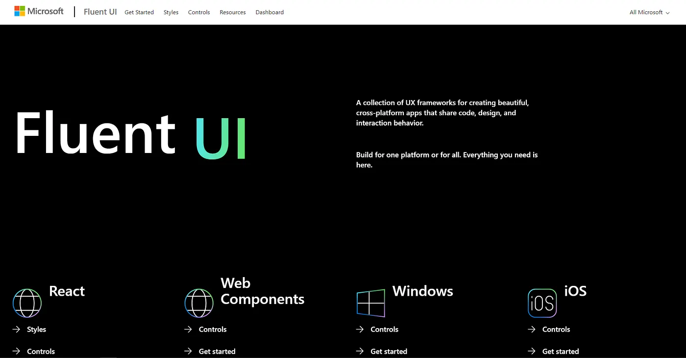
Fluent UI is an frontend open source React based UI framework, officially by Microsoft. A collection of UX frameworks for creating beautiful, cross-platform apps that share code, design, and interaction behavior. Yes, you read that right… Cross-platform support. Doesn’t matter if you build your apps for Android, Windows, iOS… Fluent UI covers it all. Microsoft 365 apps are powered by the Fluent UI itself.
1. Material UI Link to heading
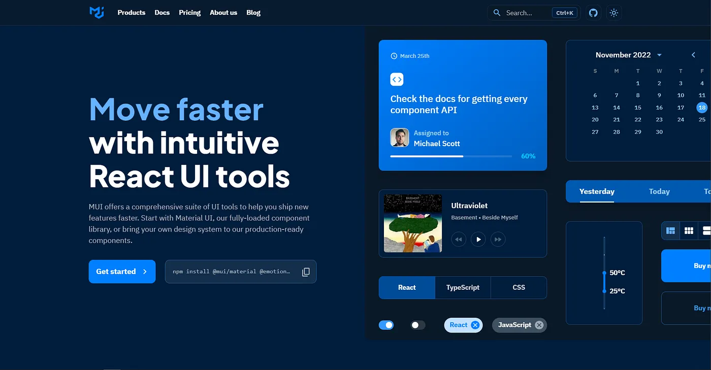
I bet you were wondering why wasn’t this included in this article… “We are talking about React component libraries and UI toolkits, but where is MUI??!!” Well exactly, it’s true, Material UI has been every developers (mostly every, YES) favorite choice for it’s most extensive design inspired themes (in literally every 2nd application out there), components for react and web explicitly, vast community support and ever changing + upgrading toolkits officially maintained by Google itself. In fact, if you’re confused which UI toolkit to choose from the above mentioned, to build your first apps… I would recommend Material without hesitation. It is what you were looking for, trust me lol.
Special Mention Link to heading
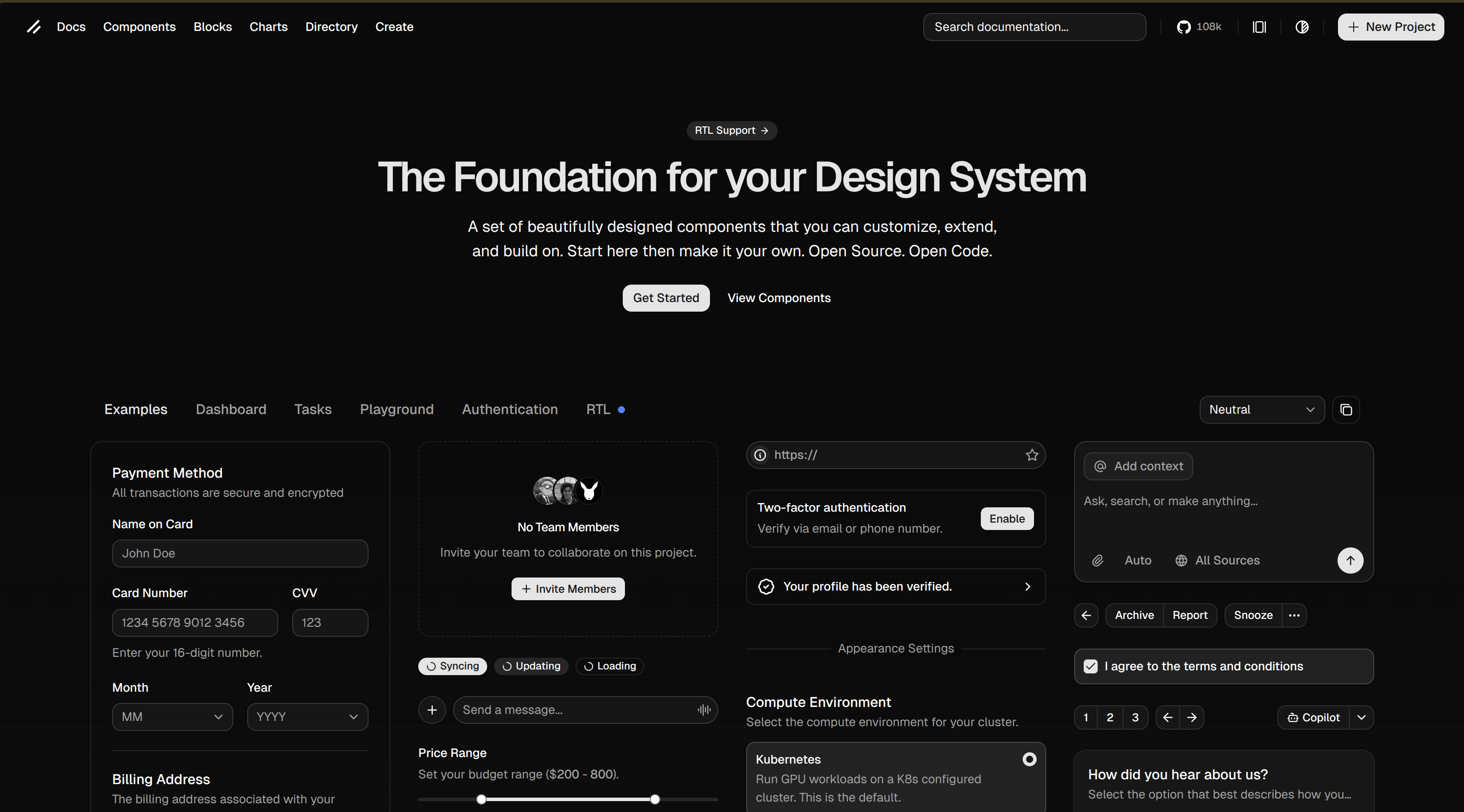
Shadcn UI just hits different. It feels clean, intentional, and effortlessly cool — like every component actually respects good taste. There’s this quiet confidence in how it looks and behaves, nothing flashy, just pure elegance. Building with it feels smooth and satisfying, like everything is finally where it’s supposed to be. It makes you want to polish the tiny details, to care more about your UI. Honestly, once you use it, everything else starts to feel a little… loud.